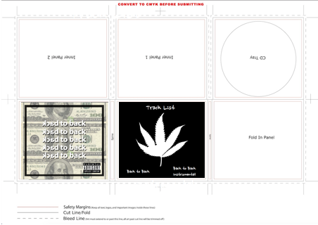
For the CD case, I created a photoshop canvas size as this is the size as an actual CD case. Width 14cm and Height 12.5cm.

For the front cover I have created a stereotypical rap cover including typical conventions of the rap genre such as money. I have also put the name of the song "Back to back" on front repeated multiple times.
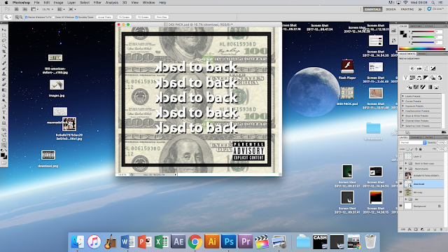
For the font of the writing I added a drop shadow and stroke to make it stand out a little bit more at first glance and bring the viewers attention to the name of the song. I changed the opacity and fill of the background to make give it that washed out effect, again making the viewer focus on the name of the song. I finally added a black border and the parental advisory logo to make it look a bit more profssional and more like an authentic album cover.
Front cover:

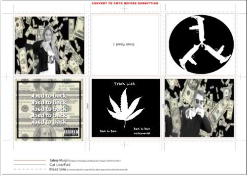
I then placed this image onto the template for the CD case using photoshop

The album cover was a little bit too small so I had to extend it out to fit to the bleed line.
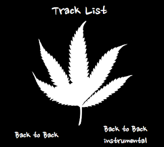
I then had to create the back of the CD cover before designing the inside of the cover. The back cover theme is drugs and in this case weed. Drugs are stereotypical when associated with the rap genre therefore I tough that I would include them on my album cover. Drugs are also used in the music video therefore this links to the media product (music video). The weed plant also suggest a 60s feel as hippy-culture, which was not what I had originally intended, however combined with the black and white colouring of the money, its keeps up a modern, urban hip-hop feel.
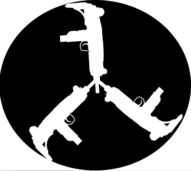
Since guns is a stereotypical ideology within the rap genre, I wanted to have gun images somewhere within the digi pack. I decided to put them on the actual CD Tray. Instead of copying someones image from online, I was able to just get the outline of the gun by using photoshop. In other Drake music videos such as "Energy", Drake can be seen holding his hands out, pretending that they are guns. The guns on the CD cover relate to both our music video and Drake's other music videos, as there are multiple scenes of the rappers in our music video using their hands to form gun shapes, very similar to that of "Energy". The guns are deliberately ironic as Drake isn't a violent rapper and isn't in any gangs etc. Drake is a very respectable artist that could be considered as family friendly, besides the explicit language of course.
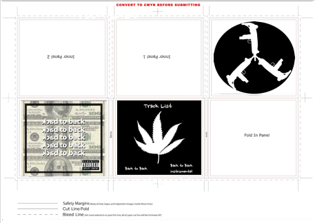
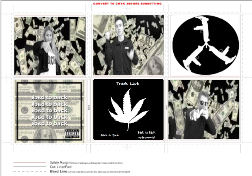
For the other sides of the digi pack I will be using screenshots taken from the music video
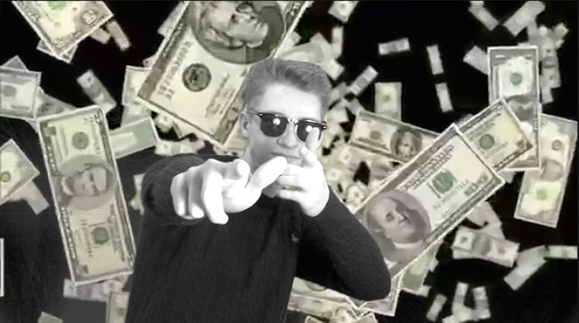
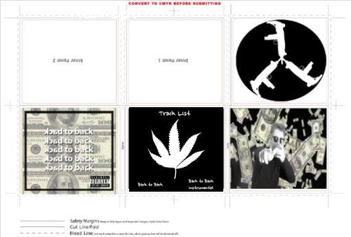
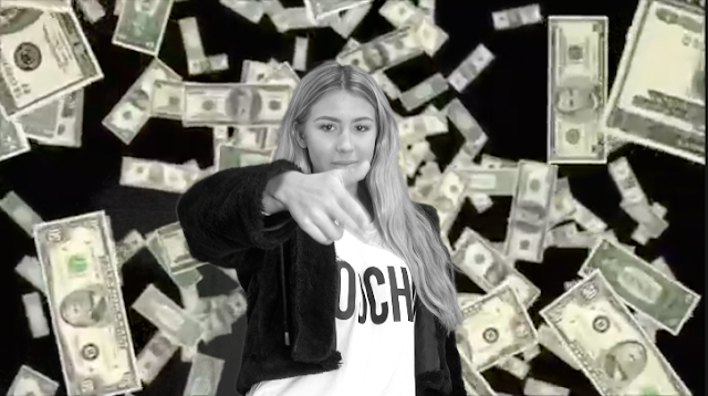
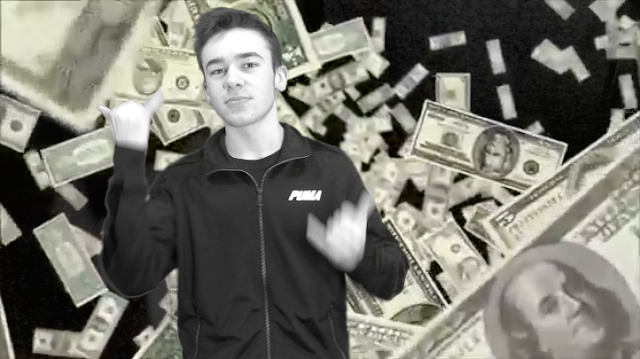
The screen shots that I chose to use included each performer from the music video. I decided to do this as everyone had similar screen time.
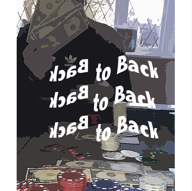
For the second part of the digipack I had to create a poster for the music video therefore I had to consider genre, stereotype and inspiration from our artists Drake. My posters style has been inspired by some of drakes previous music posters such as this one...
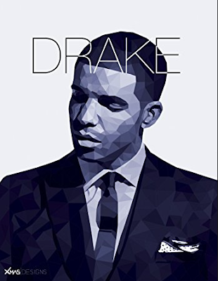
I was inspired by the use of effects to make Drake look like a cartoon, therefore I used a similar effect on my poster
